In-depth case studies from product strategy and ideation to prototyping, user testing and shipping the final product.
Redesigned the contacts database for the Academic tier.
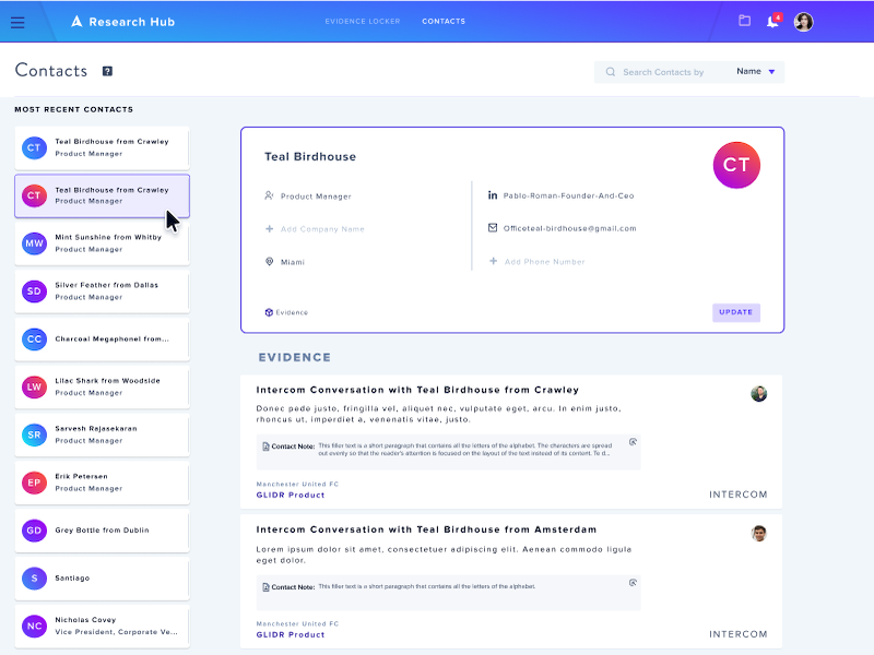
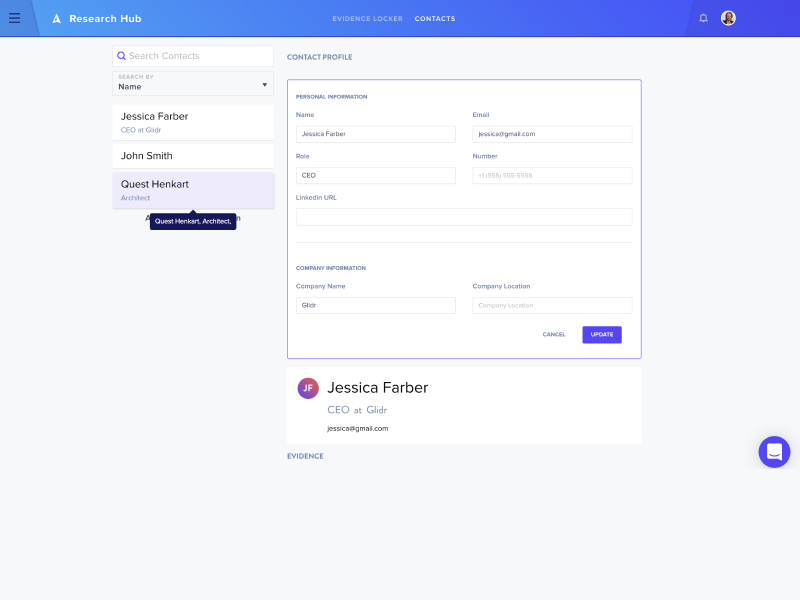
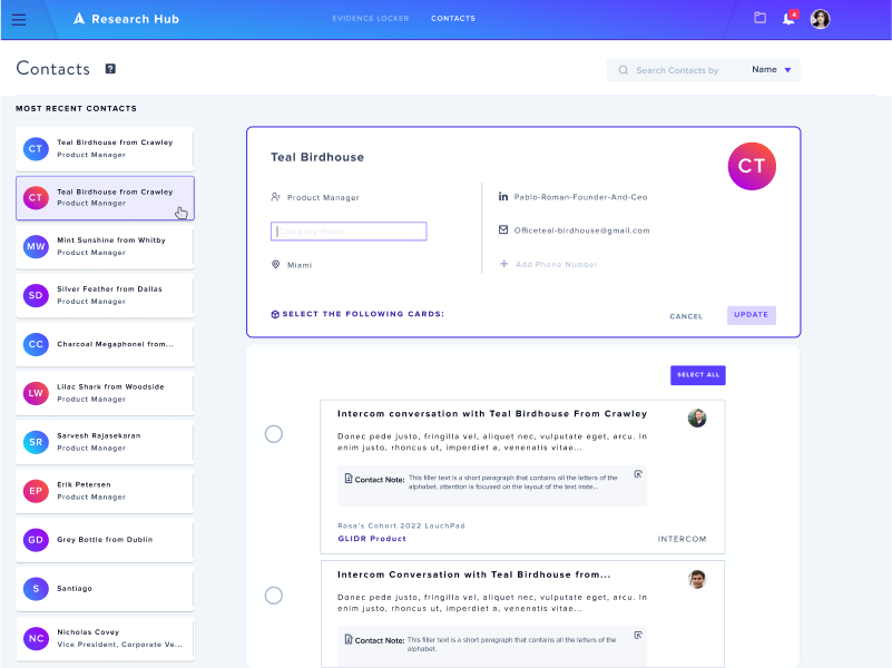
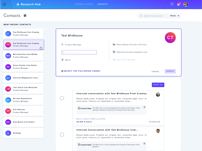
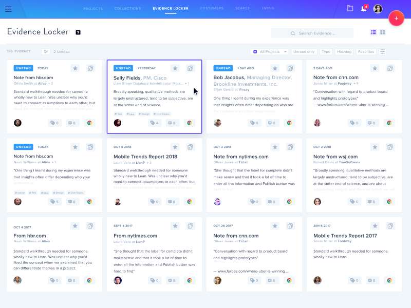
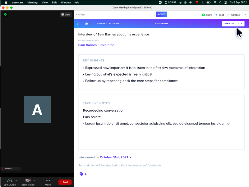
Glidr.io has a space for all contact information. These profile cards allow users to keep all their information and details such as name, phone number, email, role, company, location.
All this data is connected to all projects within the application to facilitate and identify customers.
One of the main reasons to redesign this functionality is to fix the content and interface.
Update the design and responsive elements, allowing the correct interconnection of the content.
The problems we observed is that 90% of users get a bad impression of the UI and the lack of consistency within the app. We want to maintain the basis of the existing design by remodeling it with new modern segments and designs.
We want to consider optimizing for a better UI but also a better experience when interacting with all the “user profiles”.
Glidr.io targets -university students- teams ages 19–25 years old, using the app for research.
Its customer base also includes - company researchers, students, company employees - people between the ages of 25 and 50.
Our target is everyone who uses our app, as this is the main information that everyone needs in order to identify themselves as part of any organization and projects.
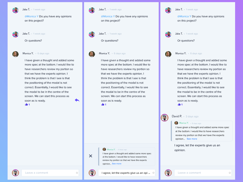
Users need a place to store their information and the ability to connect evidence.
Based on our interviews and feedback, we have observed that the current design does not fit with the rest of the application.
It lacks order in the organization of information, there is no consistency with the rest of the app and it is not responsive.
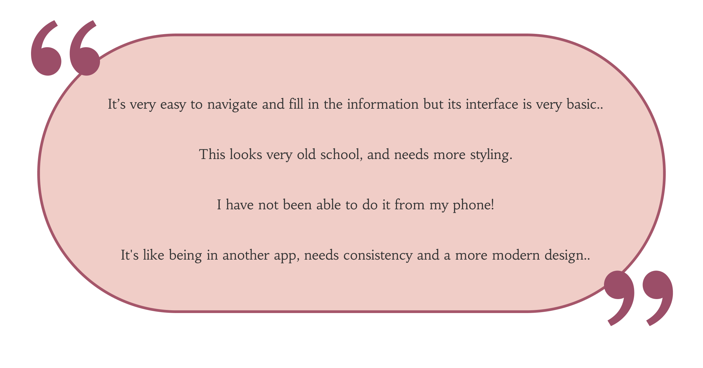
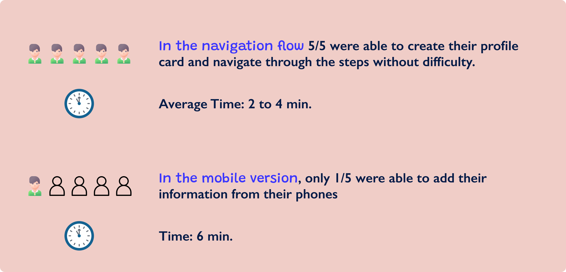
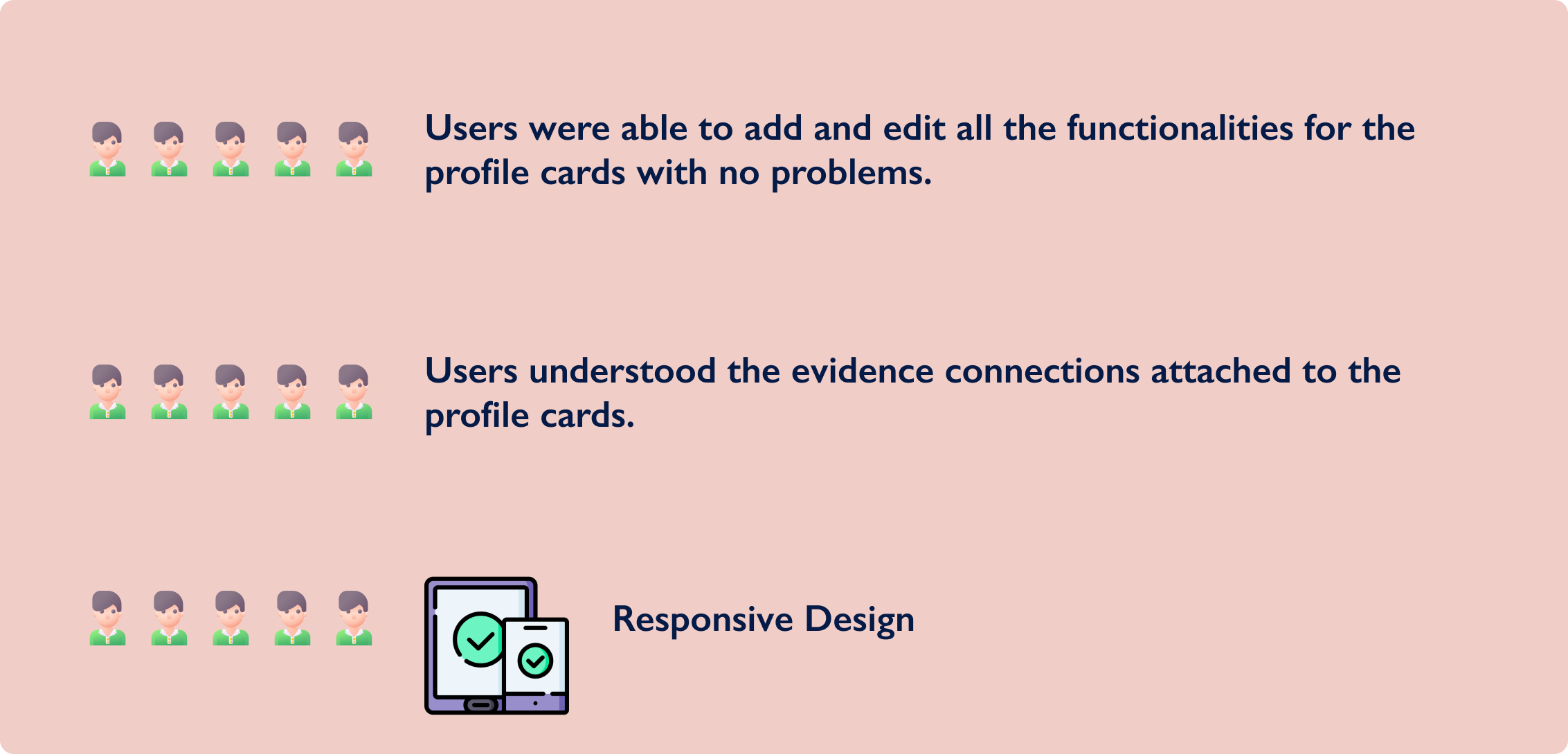
We interviewed 5 people and asked them to fill out a profile card and complete all their data.
This is what users had to say during the usability tests:
Our application needs to update the design to:
A representation of our target audience data, gathered in previous research such as user interviews. I created this user persona to analyze various aspects of their behavior and motivations.
.png)
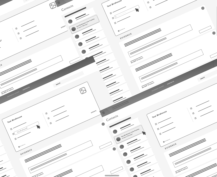
Previous Design
We identified the priorities and found what was working and what wasn’t to be able to create a list of desired design changes.
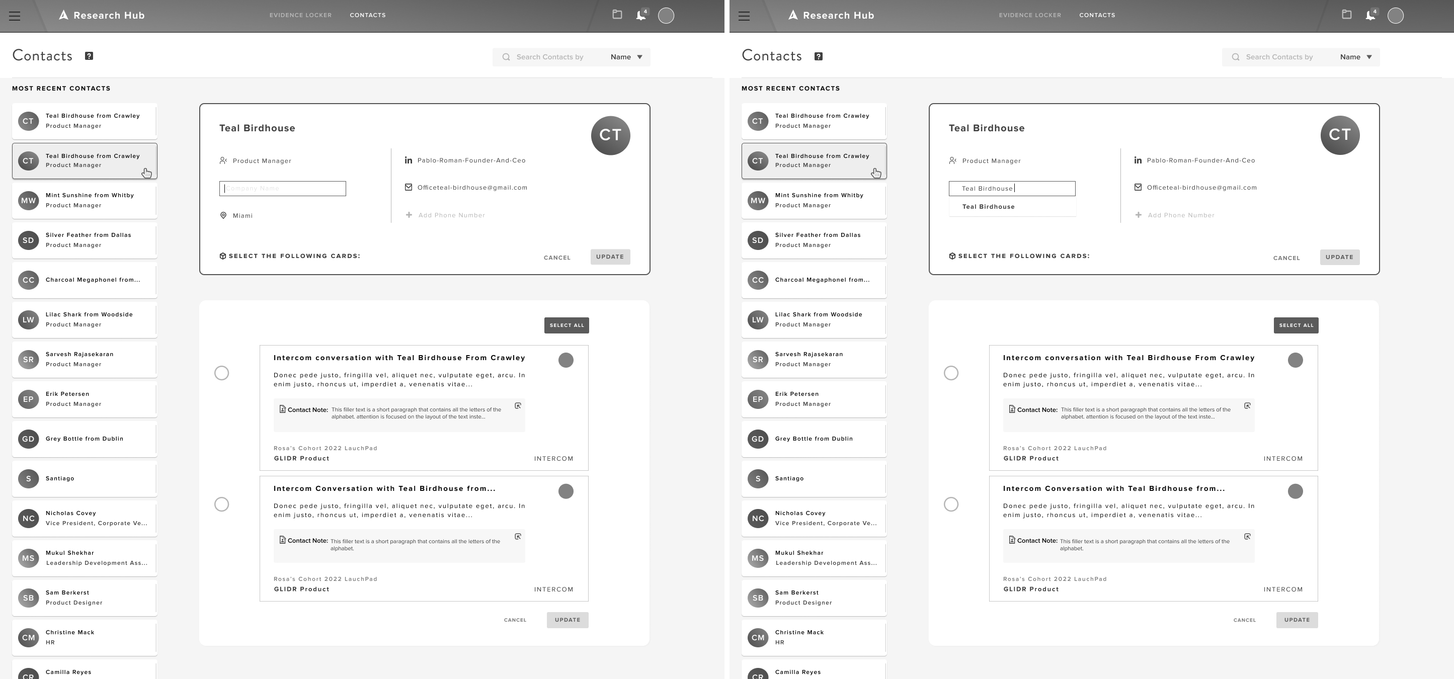
We were able to compare the new design to the previous one which showed us that by adding these features, users were able to link more information on the same view and with fewer steps.
Our idea was evaluated and so several designs were created.
After analyzing and researching the best way to create our database in a simple way and with a few steps, we came up with these first sketches.
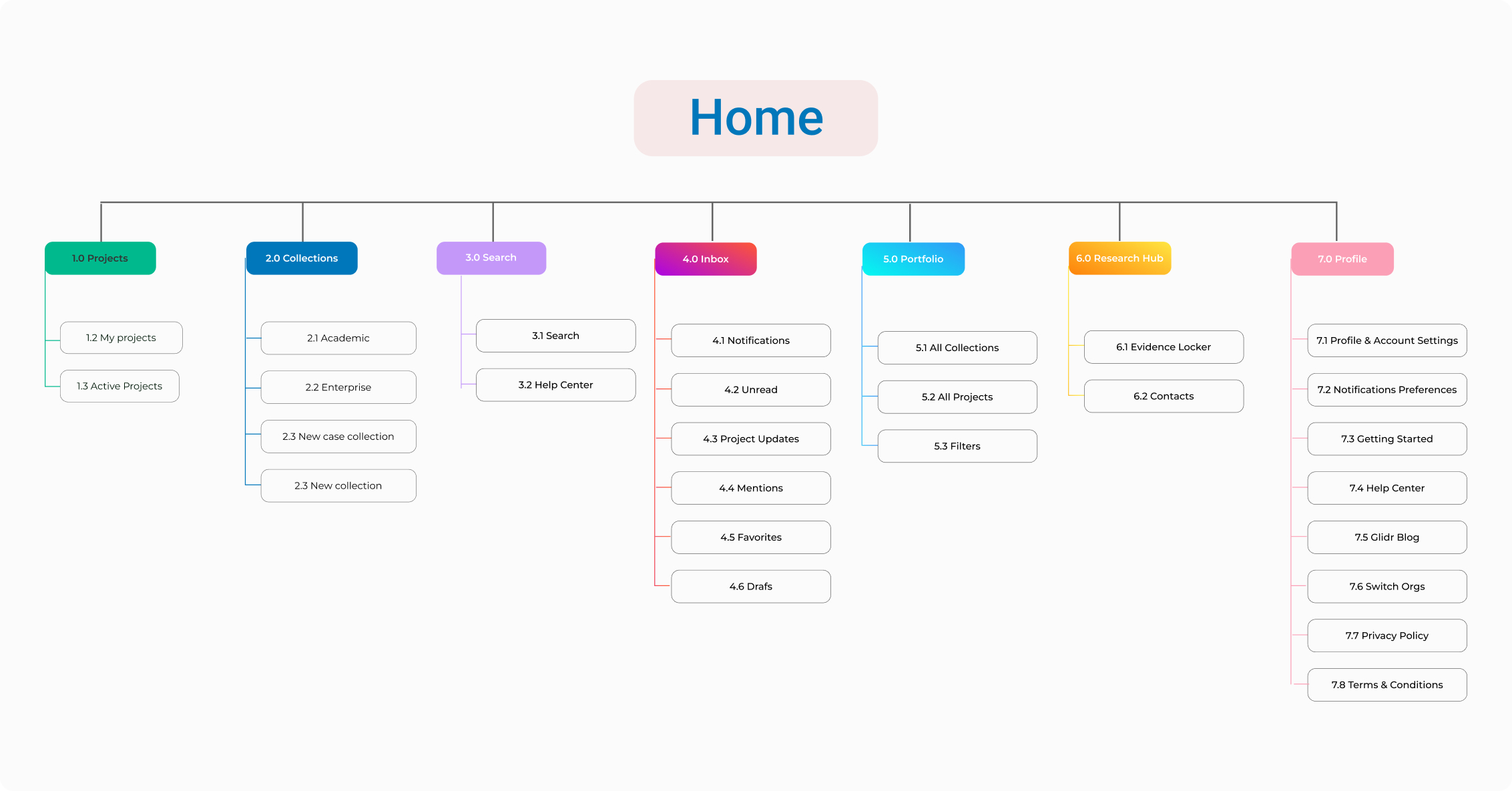
Here I’m mapping out the structure and organization of pages, and content in our website.
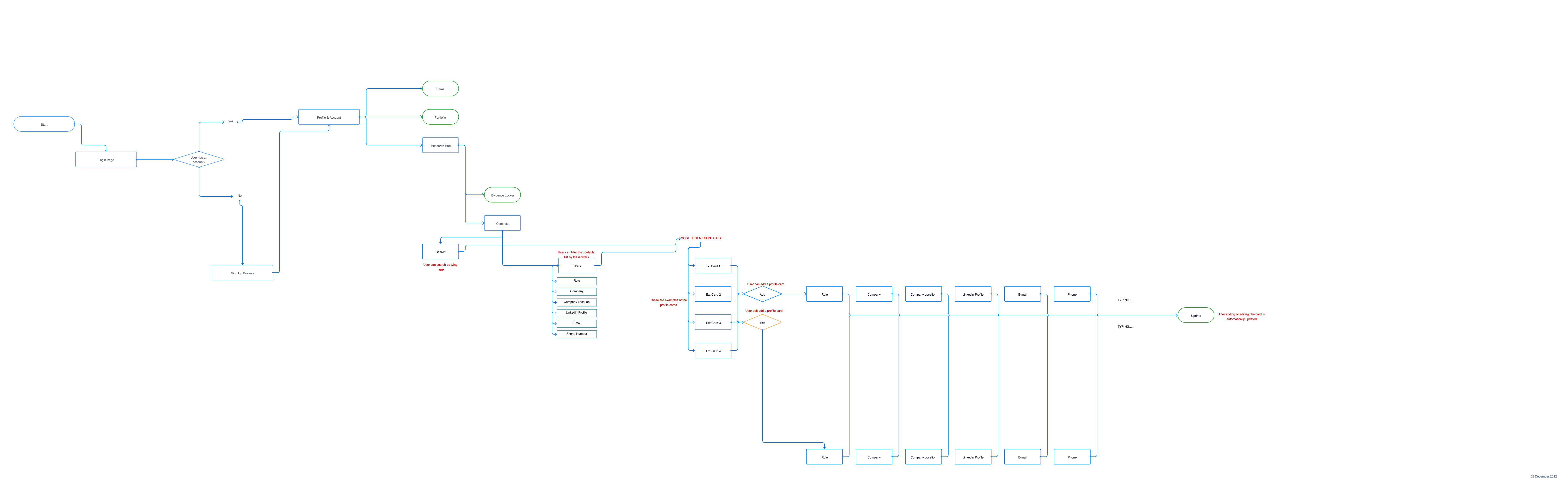
Here we can observe the user's path to get to their final goal. It includes each step, from the starting point to the endpoint.
In this case zoom into an specific area (micro level), and created a more focused and detailed map.
With this process we can find out how easy or difficult it is for users of a product or service to interact with it, and we can now design our prototypes with the following tasks.
The new design was successful, users were very happy with the redesign.
The main pain point here was adapting new features to an existing design. We had to understand how to integrate important parts of the existing blueprint to be able to create more value and engagement into the design, but without changing the fundamental design.
Always prioritize consistency.
By ensuring consistency in all our designs, we will not only have great usability, but also great functionality and ease of learning. Users will be able to easily navigate our application without stopping to wonder if they are doing something wrong and become familiar with the product.
I was the sole UX/UI designer for a seven year old company with customers around the world including government, top universities, enterprise and startups. I was responsible for the project, while collaborating with the rest of the team on ideation.